


Light and Shade
Visual identity designed for Light and Shade, a series by It’s Nice That exploring the challenges at the heart of the AI–creative conversation. As AI becomes increasingly present across the creative industry, the series examines both the opportunities and dilemmas faced by the community.
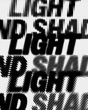
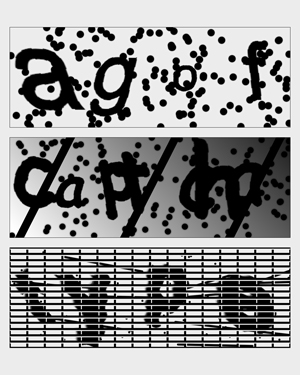
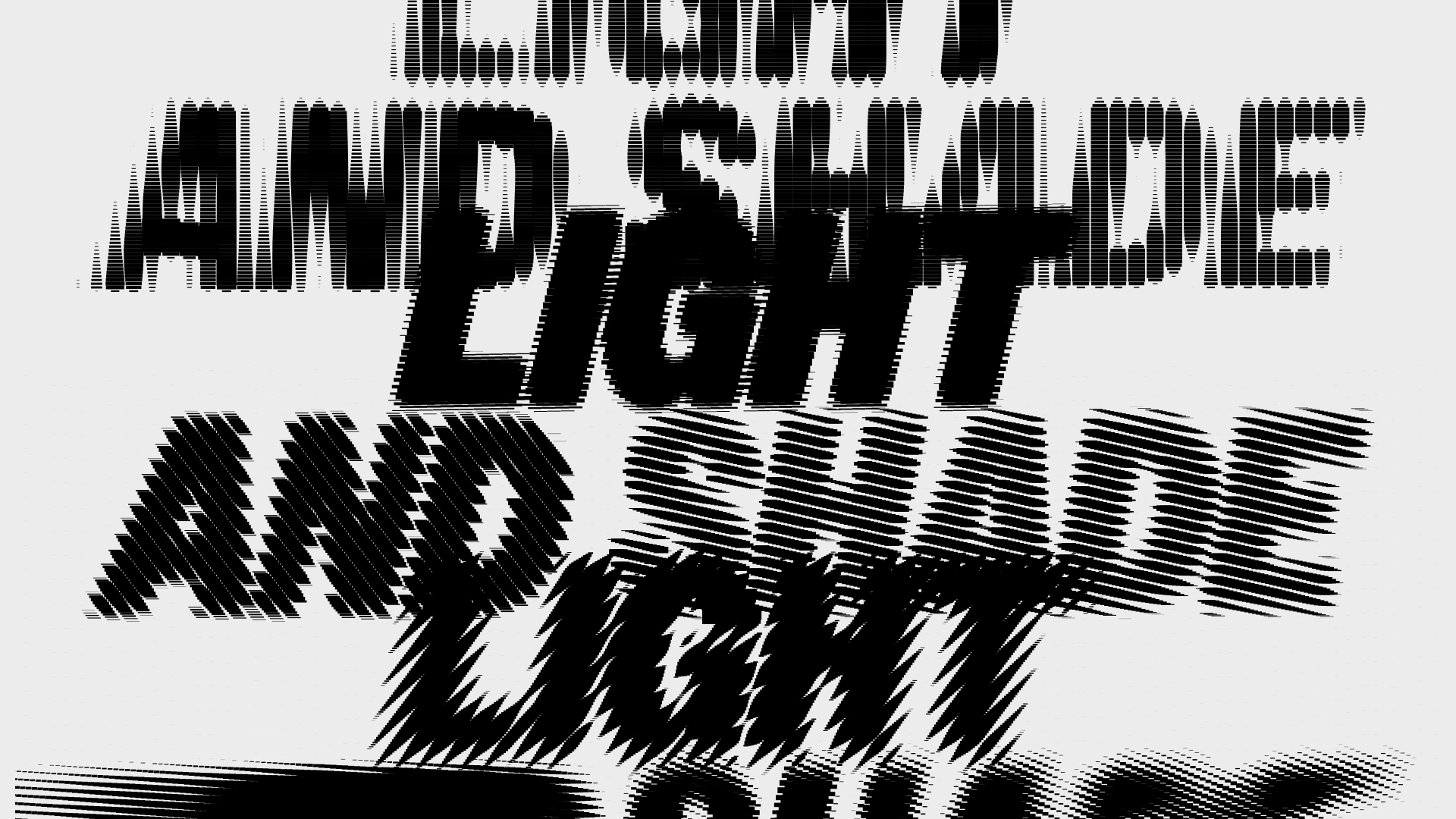
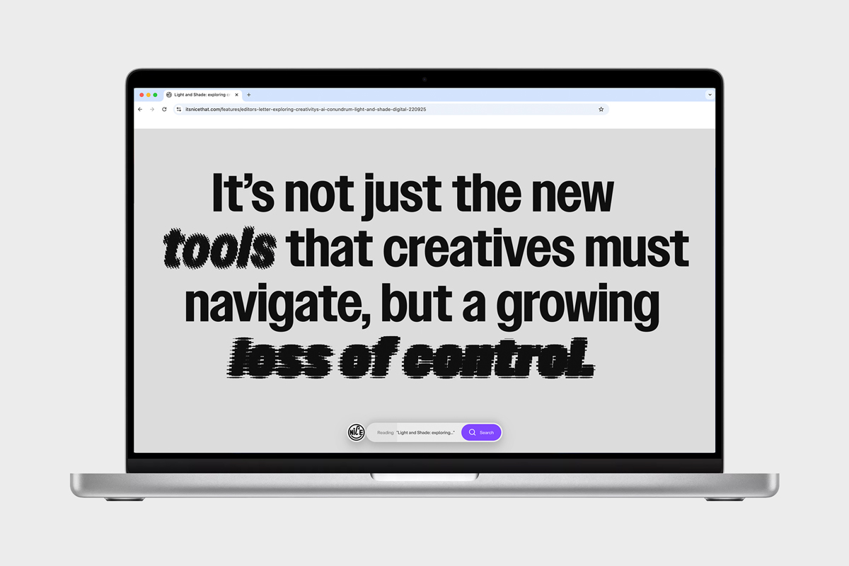
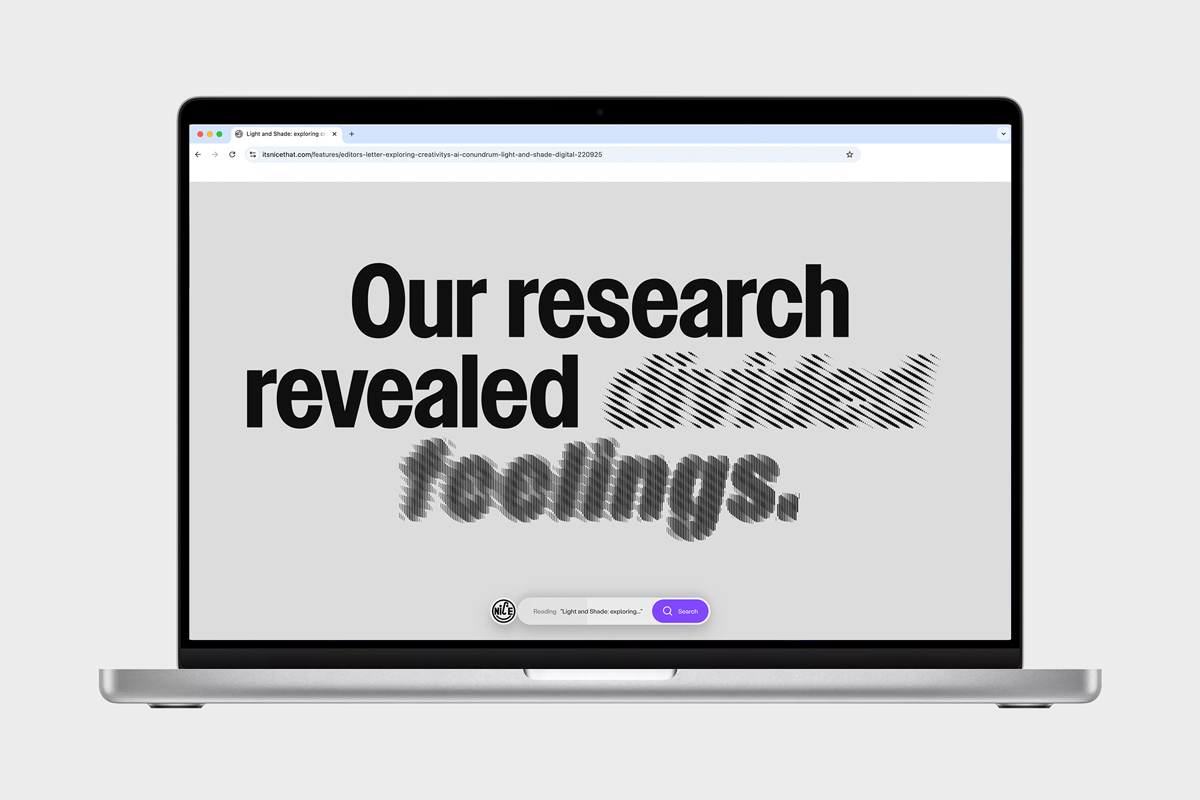
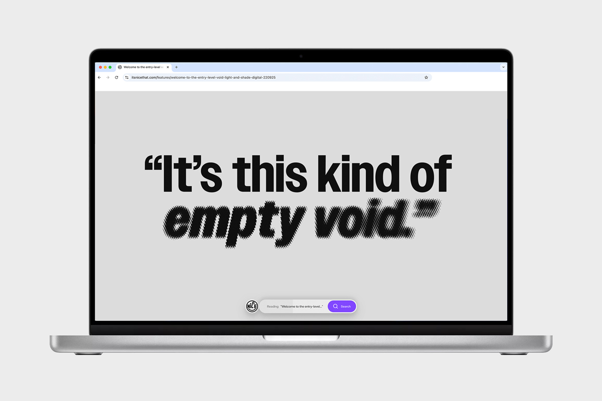
The identity is built around the idea of hiding and revealing. Typography becomes the central tool, with shadows and spotlights used to conceal, expose, or highlight content. Motion emphasises this effect, shifting in speed and direction to suggest rewinds and fast forwards, echoing the changing pace of the creative process in the age of AI.
Intersecting typographic shapes simulate the effect of light and shade in a graphic way. This treatment defines the logo, layouts, and motion behaviour, forming a flexible system that visually reflects the series’ central theme.
Visual Identity
Motion Design
Art Direction
Guidelines
Templates
It’s Nice That: Ruby Boddington, Lucy Orr, Saskia Vokes Articles’ illustrations: Haikoo Studio, Yuto Tamura, Jordon Bolton, Victor Hwang, Rob en Robin Typeface: Owners by MCKL