


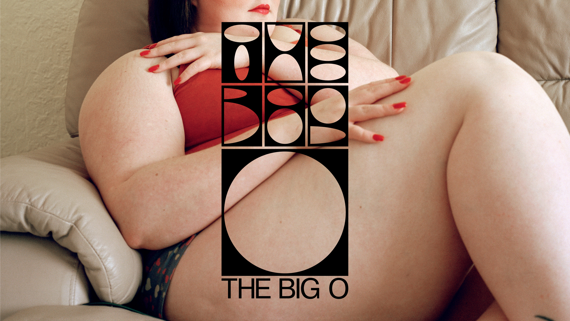
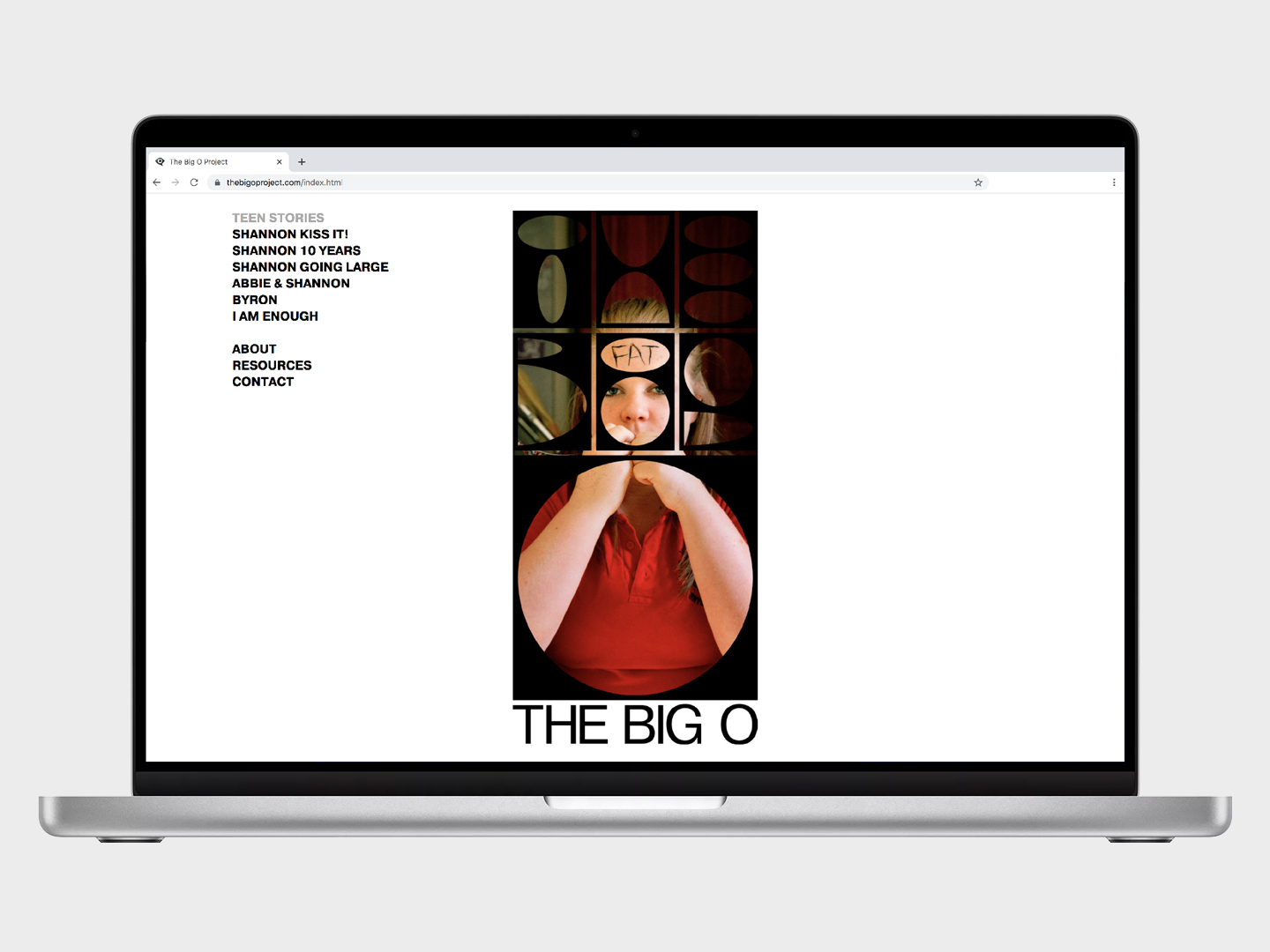
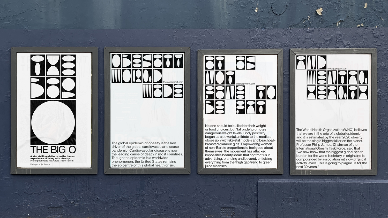
The Big O
Visual identity designed for The Big O, a project by award-winning British photographer Abbie Trayler-Smith. The Big O is a storytelling platform on the human experience of living with obesity.
Through an ongoing series of portraits, Abbie’s aim is to “challenge the stigma and preconceptions around what it means to be ‘fat’ while also questioning the impact obesity is having on society”.
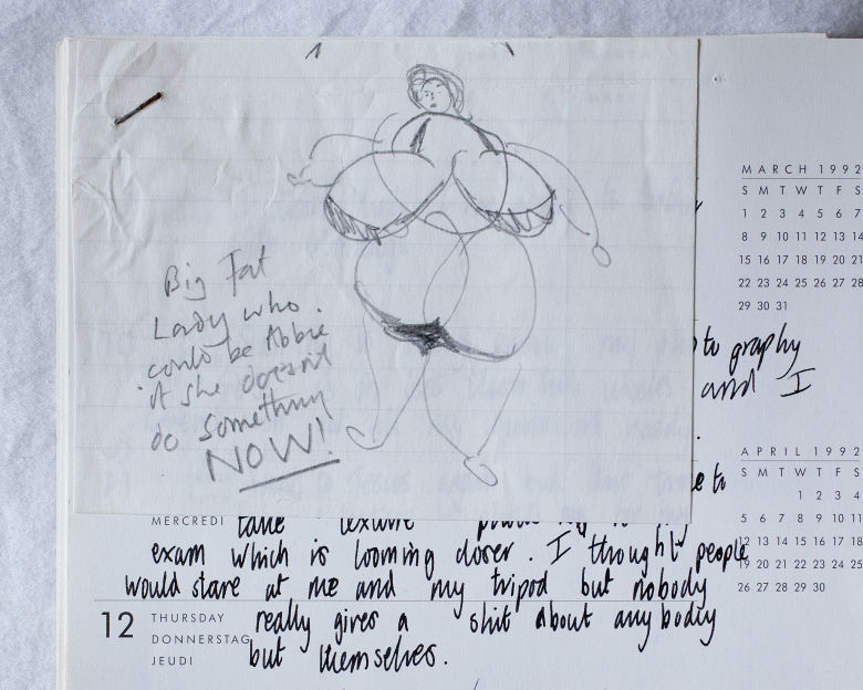
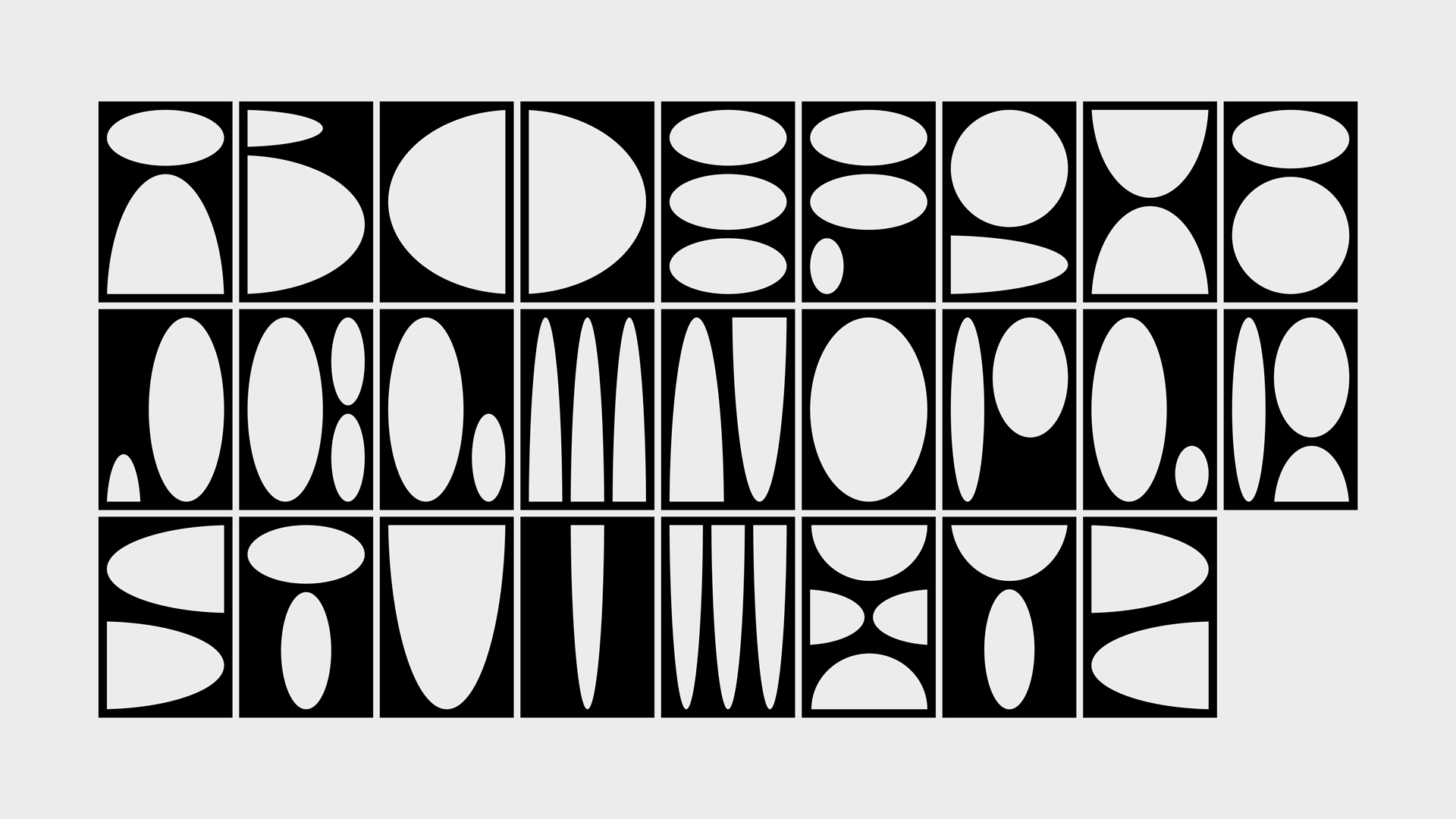
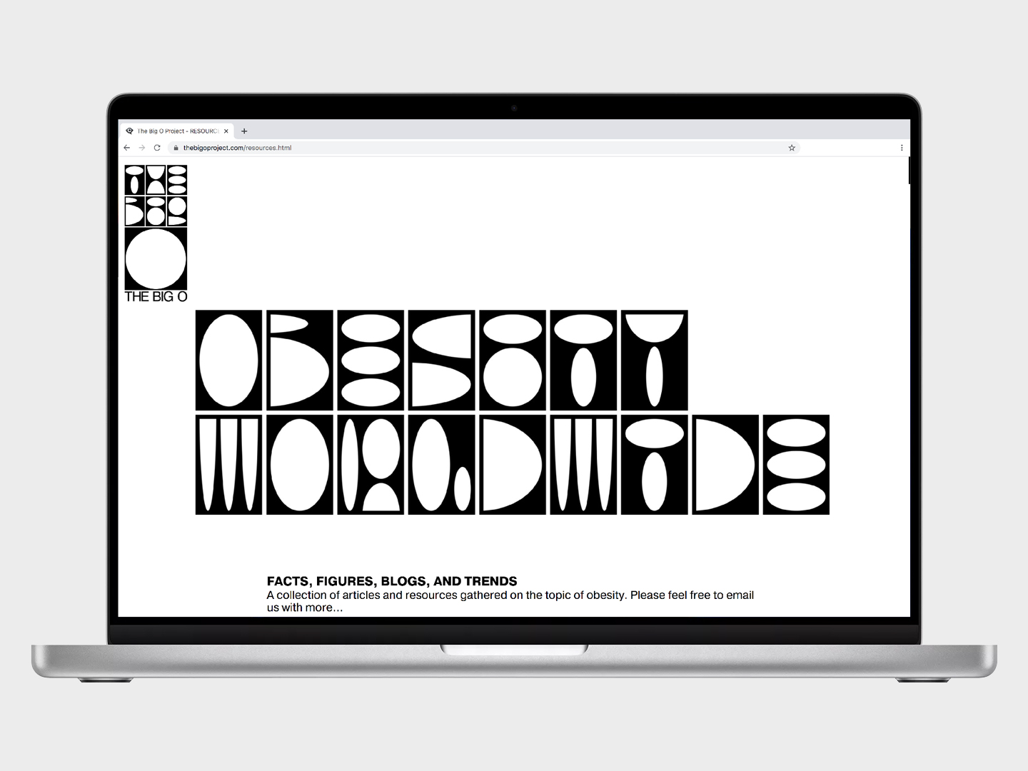
The design concept draws inspiration from a sketch in Abbie’s diary, which features a series of circles arranged to symbolise an overweight body. The identity features a bespoke typeface, which resembles human curvy shapes. The exaggerated counters are a hint to the way individuals affected by obesity may see their figures as altered. Each letterform is encased within a shape, reminiscent of feeling confined within one’s own body.
The logo also works as a stencil, allowing to focus attention on the body details. It’s a visual approach that links back to the goal of Abbie’s project and how obesity “isn’t a hidden problem, it’s one that you wear, one that everyone can see. One that makes it harder to run away from”.
Visual Identity
Website Design
Type Design
Campaign
Photography: Abbie Trayler-Smith
Project Management: Claudine Boeglin
Website Development: Jérôme Guckenheim
Production: Marina Vitaglione